Act 11. Playing Notes by Image Processing

Musical score sheet

For this activity we will be using our image processing skills to be able to play the musical score sheet presented using Scilab. Due to the lack of time, I was not able to successfully achieve my goal here. I will still however, present on how I supposed the problem should have been attacked. First I will convert the  score sheet into a binarized image since most of our knowledge deals with them. It would be helpful to divide the image into smaller segments that are easier to handle such as a single line. Correlation must then be implemented to determine the notes one segment at a time.

Sample binarized segment of the entire score sheet

Act 13. Color Image Segmentation

In activity 10 we have successfully specified our Region of Interest (ROI) by morphological operations and filtering out regions with certain area measurement. For this activity, we will again be dealing with specifying ROI, only this time we will be using the color of the ROI to do so.

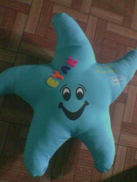
We begin by finding an image of an object with roughly monochromatic color. Figure 1 shows the image that I will be processing for this activity.

Figure 1. Image to be processed

A monochromatic region was then cropped. I chose 3 different regions – one from the bright side, one from the dark side, and one from the middle – for comparison. These regions are shown in figures 2-A, 2-B, and 2-C respectively.

Figure 2-A ROI 1

Figure 2- B ROI 2

Figure 2- C. ROI 3

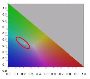
A 2D histogram of the ROIs were obtained for the non-parametric segmentation. It was also used to check if my code is working as it was supposed to. By comparing the histogram to the RG chromaticity diagram provided I can check if I’m getting the right histogram. A sample comparison can be seen in figure 3. For a clear comparison I used a colormap to plot the histogram of the ROI instead of the usual 2D plots. I then superimposed a semi-translucent chromaticity diagram in the colormap. The light pixels, encircled in the figure, indicate the points where the histogram has a high value. It can be clearly seen that these pixels coincide with the cyan-ish region of the given diagram which is the color of the ROI.

Figure 3. Histogram of sample ROI (colormap) superimposed with RG Chromaticity Diagram

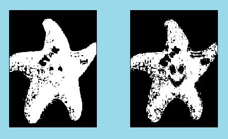
Image processed using Parametric (left) and Non-parametric (right) Segmentation using the ROI 1

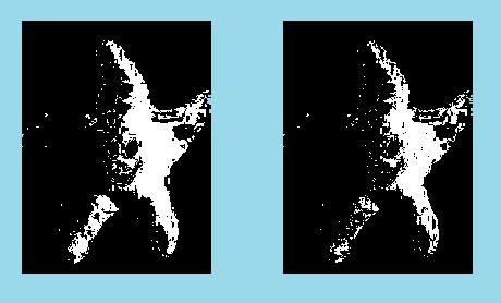
Image processed using Parametric (left) and Non-parametric (right) Segmentation using ROI 2

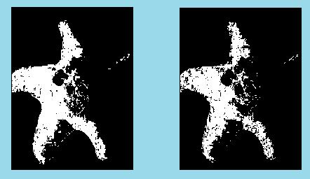
Image processed using Parametric (left) and Non-parametric (right) Segmentation using ROI 3

It can be noticed that when the ROI was cropped from the dark side the resulting image showed less of the bright side while the opposite happened when theROI was cropped from the bright side. Getting the ROI from the middle resulted to an image that is closest to the original image. This mean s that the middle area represents more of the colors in the desired image than the other two ROIs. Comparing the results of Parametric and Non-parametric segmentation we could see that the parametric one resulted to a cleaner image with more defined edges. The star shape which is the desired region was more clearly separated from the background using parametric segmentation. However, the non-parametric segmentation resulted to a more detailed image. Compared to that of the parametric, the details inside the ROI (which are not part of the ROI) are more defined in non-parametric segmentation. Overall, I would say that Parametric segmentation yields better results however, it depends largely on the desired application.

I would like to thank Jonats for sharing his insights

Grade: 9/10

— to be continued

Act 12. Color Image Processing

For the past activities we have always been working with either binary or grayscale images.  But wouldn’t it be a waste if we would just convert every image that we have to grayscale whenever we want to enhance it. In this activity, we will learn some image processing technique that will help enhance the quality of our images without giving up its color, well at least not all of it.

First we gather colorful images (with something white in the background) using different white balance options available with our camera. I used my Nokia 2700 camera phone for this so my images were not that highly resolve but they will do just fine. There are four white balance settings available in my phone – Auto, Daylight, Incandescent, and Fluorescent. The images obtained using these settings are shown in Figures 1-4.

Figure 1. White balance set to 'daylight'

Figure 2. White balance set to auto

Figure 3. White balance set to 'fluorescent'

Figure 4. White balance set to 'incandescent'

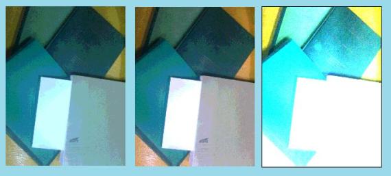
Among the four images the one captured using ‘Incandescent’ setting is chosen for enhancement since it looks a little too blue. This is probably in consideration for the yellow orange – ish color of the light coming from an incandescent bulb.

Figure 5. Image (left) processed using White Patch Algorithm (middle) and Gray World Algorithm (right)

Figure 6. Image consisting of objects with the same hue (left) processed using White Patch Algorithm (middle) and Gray World Algorithm (right)

For the two examples, the white patch algorithm gave better results than the gray world algorithm.

I would like to thank Jonathan Abat for sharing his insights about this activity

Grade: 9/10

— to be continued

Act 10. Binary Operations

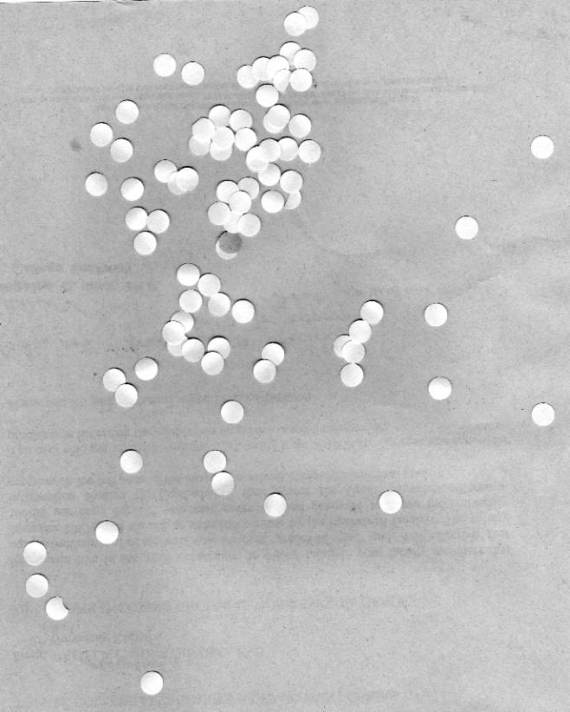
And so it is now time to apply what we have learned so far, or at least some of it. For this activity we will be using an image of scattered punched paper, shown in figure 1, which we will treat like cells. The objective is to be able to estimate the area of a single cell (one punched paper)

Figure 1. Image to be processed

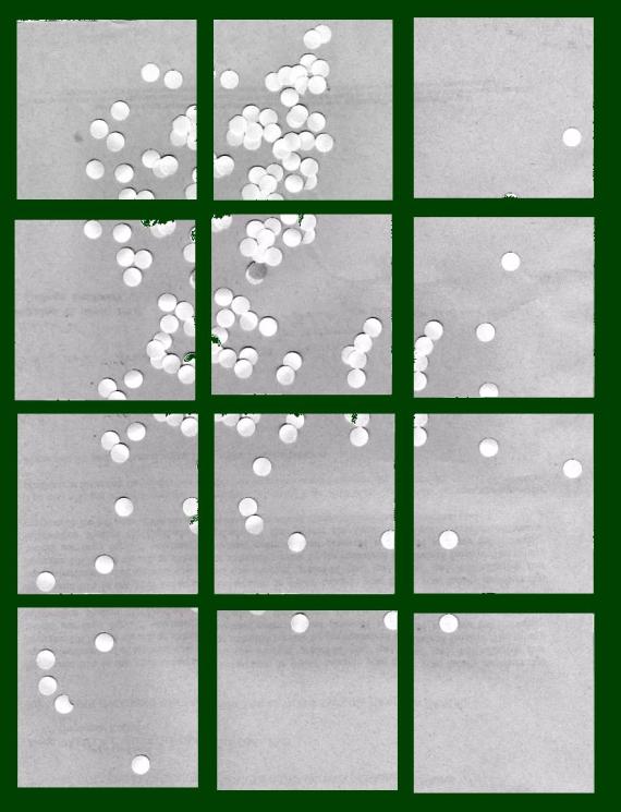
Part of the activity is to be able to design the program such that it will process one sub-image at a time in a loop. This could easily be done using for loop and naming each subimage properly (i.e.: name1.jpg, name2.jpg, name3.jpg, …). So we divide the image first into twelve 256X256 subimages as shown in figure 2.

Figure 2. Original image cropped into twelve 256x256 images

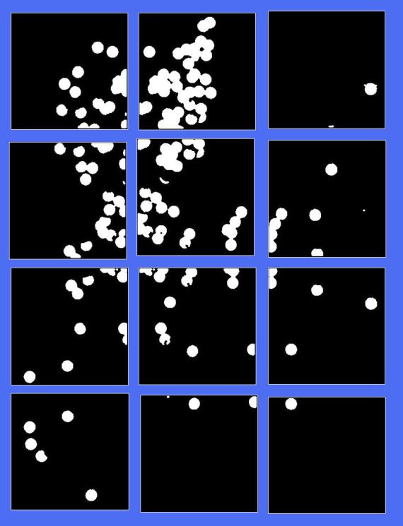
We then binarized the images and perform opening and closing operations to clean them up and separate as much cells from one another as possible. The results are shown in figure 3. (Review: to open means to erode then dilate an image while to close means to dilate then erode an image)

Binarized images after closing and opening

The command ‘bwlabel’ was used to label each blob on the image. By analyzing the histogram of the area of each blob, one will have an idea on the range of area measurements that are possibly single cell. Using this range, we can filter the region(s) of interest. By averaging the areas of these ROI’s we can have our best estimate for the area of a cell which was found to be 514 pixels. For reference, I cropped an image of a single cell and computed for its area which is 500 pixels. My approach obtained an error of 2.8%.

Reference cell

— to be continued

Act 9. Morphological Operation

Morphological operations

Images to be processed. (Solid square, Triangle, Hollow square, Cross / Plus sign)

//Strels
one= [1 1;1 1];
two= [1 1];
three= [1 ; 1];
four= [1 0 1 ; 0 1 0 ;1 0 1];
five = [0 1; 1 0];

Solid Square

Dilation

Erosion

Triangle

Dilation

Erosion

Hollow Square

Dilation

Erosion

Cross


Dilation

Erosion

Effect of 'skeleton' command on the images

Effect of 'thin' command on the images

— to be continued

Act 8. Enhancement in the Frequency Domain

From previous activities we have familiarized ourselves with Fourier Transform, giving us idea on what result would we get if we apply FT on certain patterns. In this activity we would use our knowledge of Fourier Transform to enhance certain images by removing visible repetitive patterns on them using filter masks.

A. Convolution theorem

Before we do the actual filtering, we familiarize ourselves first with generating shapes and getting their FT’s using scilab, the convolution theorem, and working with dirac deltas.


Figure 1. Dots and their Fourier Transform

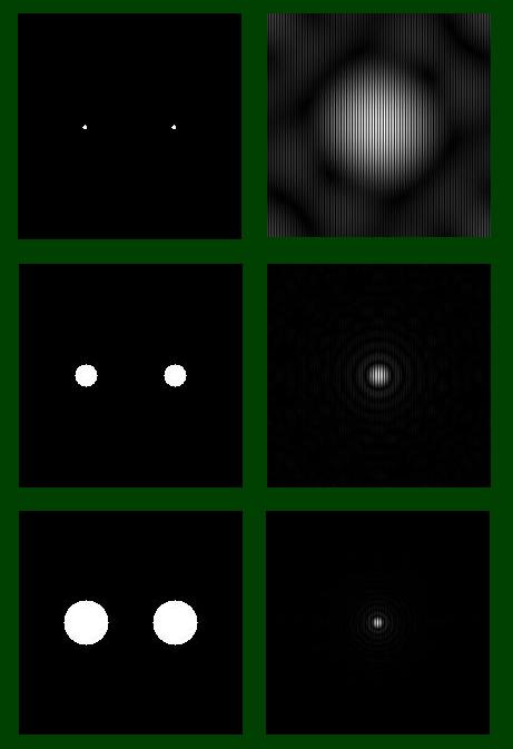
Figure 2. Circles of incresing radius (left) and their Fourier Transforms (right)

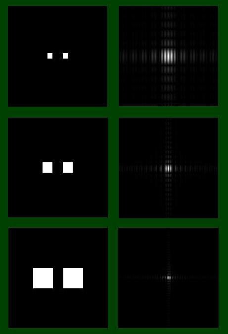
Figure 3. Squares of increasing widths (left) and their Fourier Transforms (right)

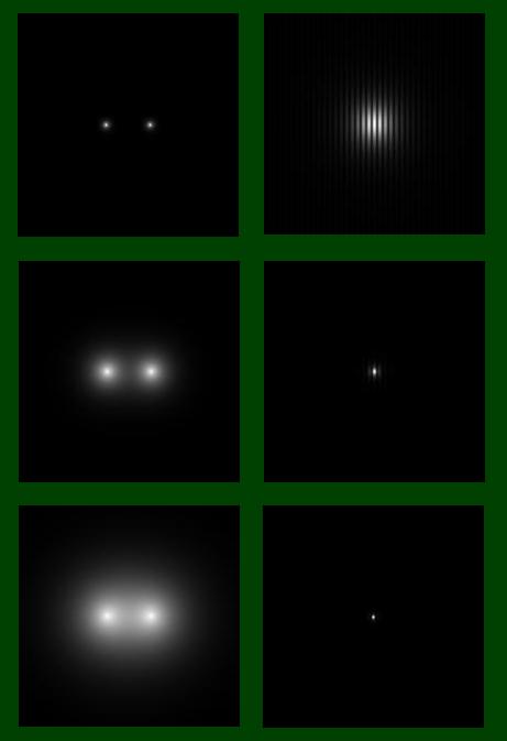
Figure 4. Gaussians of increasing variance (left) and their Fourier Transforms (right)

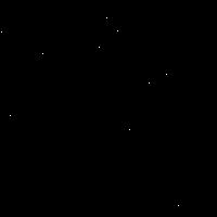
Dirac deltas in random locations

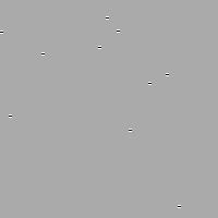
The above dirac deltas were convolved to two patterns:

a= [1 1 1 : -2 -2 -2 : 1 1 1 ];

b= [1 -2 1: 1 -2 1: 1 -2 1];

Convolution. Upper: dirac deltas convoloved with a. Lower: dirac deltas convolved with b

From the result of the convolution it is apparent that the patterns convolved with the dirac deltas were just repeated at the positions of the dirac deltas. This confirms the earlier statement that “The convolution of a dirac delta and a function f(t) results in a replicationof f(t) in the location of the dirac delta” from the manual.

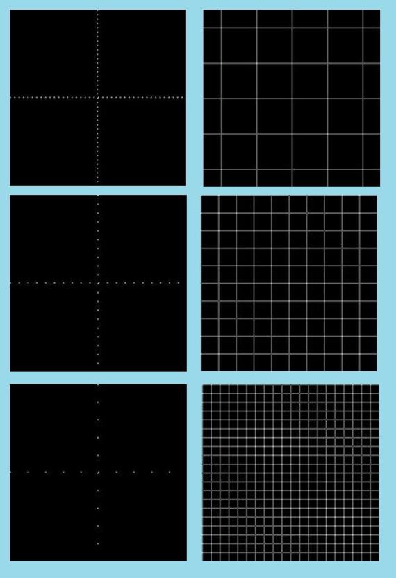
Arranged dirac deltas of increasing frequencies (top to bottom, left images) and their respective FT (right)

— to be continued…

Act 7. Properties of the 2D Fourier Transform

Fourier transform (2D): mathematical representation of an image as a series of two-dimensional sine waves.

-http://www.wadsworth.org/spider_doc/spider/docs/glossary.html

This activity deals with the properties of 2D Fourier Transform.

Familiarization with FT of Different 2D Patterns

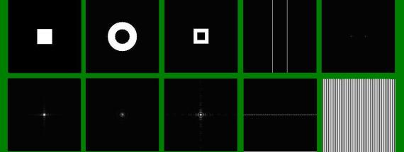
For the first part of this activity, we were to familiarize ourseleves with Fourier Transform by applying it to several 2D patterns namely:

-square

-annulus

-square annulus

-2 slits

-2 dots

The resulting Fourier Transforms are shown below:

Figure 1. 2D patterns (top) and their fourier transform (bottom)

Anamorphic Property of the Fourier Transform

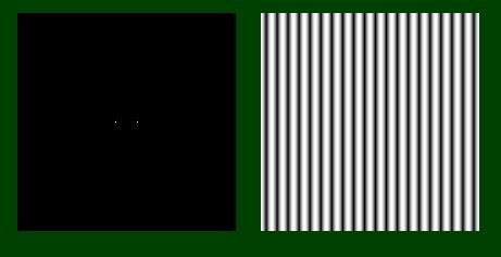
Here we investigate on how Fourier Transform varies with certain parameters in the patters. In particular, we want to know how the FT of a 2D sinusoid changes with varying frequency and rotation.

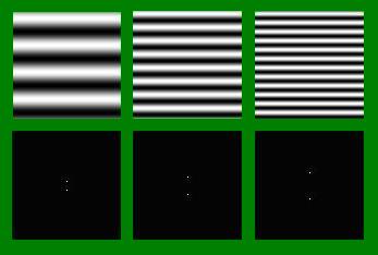
From the image below we could see that as we increase the frequency of the sinusoid the resulting FT of the pattern, 2 dots symmetric about the x axis, also increases in separation.

Figure 2.Top images are 2D sinusoids of increasing frequencies. Bottom images are their fourier transforms.

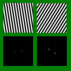
Rotating the sinusoids also produced a somewhat reverse effect to its FT, that is with respect to sinusoid that is parallel with the x-axis. In my example shown below, I rotated the sinusoids by 30 degrees and 45 degrees. Applying FT on the images resulted to 2 dots ‘rotated’ by approximately the same amount but in the other direction. (I know ‘rotated’ is not the proper term but I hope you get what I mean).

Figure 3. Rotated sinusoids (top) and their respective Fourier Transforms (bottom)

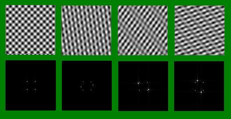
Finally, we look at how FT applies to combination of different patterns.  Below we see a series of combination of rotated sinusoids. Our base pattern is the first image shown which is a combination of 2 2D sinusoids, one parallel to the x-axias and another to the y-axis. We then add a third sinusoid rotated at different angles.

Figure 4. Combination of rotated sinusoids (top) and their fourier transforms (bottom)

Comparing their FT’s we could see that 4 dots seem to consistently appear in all four images while for the last three patterns two additional dots appeared which behaves comparable to that of the FT’s of the rotated sinusoids shown in Figure 3. The FT’s of the combined patterns seem to be a combination of the FT’s of their respective constituent patterns.

I would like to thank Mr. Entac and Mr. Abat for sharing their insights about this activity.

Grade: 9/10

Act 5. Enhancement by Histogram Manipulation

I’ve owned a digital camera for quite a while now and since then I have always wondered what the histogram option is for. I never really tried to understand it nor research about it, all I know was that it displays a graph and since it is named histogram it must be a graph of frequency of something. And then there was the third activity, my first encounter with histogram for image processing. From A3 – Image Types and Formats by Dr. Soriano it was stated that ” the histogram of a grayscale image is a plot which represents the number of pixels in an image having a certain grayscale value”. In other words, it is a graph that shows how many times a certain color value appeared in the whole image.  For this activity, we will be using Scilab to enhance a  grayscale image by manipulating its histogram.

Before we go on with the image manipulation, let me define some terms we will be dealing with for this activity:

  • Histogram – already given above
  • Probability Distribution Function (PDF) – this is the histogram divided by the number of pixels in an image
  • Cumulative Distribution Function (CDF) – the cumulative sum or integral of the PDF

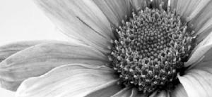
And so we begin with the enhancement by histogram manipulation. The first task is to choose an image to be used preferably something dark. I chose an image I used for the 3rd activity although it is not a particularly problematic image it would do just fine.

I cropped the original image and made it smaller to save some time processing it since my laptop is not so young anymore.

In our previous activities, I used the command histplot() to obtain a histogram of the image however, histplot only shows the histogram and does not return its actual values. The command tabul() is a good alternative, unlike the first command this returns a tabulation of frequencies so plotting it afterwards will be necessary if you need/want to see how the histogram looks. Note that these values still refers to the histogram, to obtain the PDF we must first determine the total number of pixels in the image. Since we have a rectangular image, getting this value can be easily done by getting number of pixels in one row and one column and multiplying them. I did this by using the command size(). We then divide the histogram with this value to get the PDF, cumsum() was then applied to get the CDF.

To be able to enhance our image we generate a new CDF as we desire, say for example a linear CDF. We use backprojection to see the equivalent image of our new CDF this is done by:

  • first getting the gray scale value of a pixel then finding its CDF value
  • trace the CDF value in the y-axis of the desired CDF graph
  • obtain the equivalent gray scale value ( in the x-axis) in the new CDF graph and use it in place of the old one
  • do this for all pixels

The results I obtained were as follows:

Comparison of the effect of different CDF's. (click on the image for better resolution)

We could see that the original image is not so different from the 2nd one which uses the function ‘y=x’ this means that the original CDF is approximately linear. The third and fourth CDF’s (logx and x^3 respectively) show extreme effect to the image one being too bright while the other too dark. The fifth one is quite ok butI think the linear CDF is still better.

However, the enhancement above is not really categorically an ‘enhancement’ since the original image is better (or almost the same) with the processed images. It was actually more of an exploration of the technique presented in this activity so here is another application of the histogram manipulation technique, this time with an old picture of mine together with a couple of friends from highschool.

Me and my friends. In your left is the original gray scale image while in your right is the enhanced image

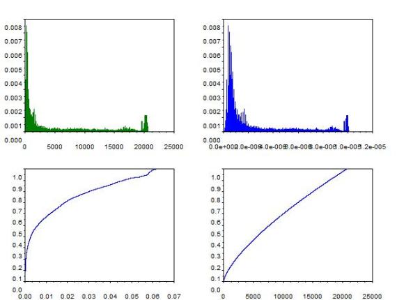
Comparison of the PDF's and CDF's. Left plots corresponds to the original images while right plots are those of the enhanced

See the ‘enhancement’ now? I used ‘y=x^.7’ for my desired CDF.

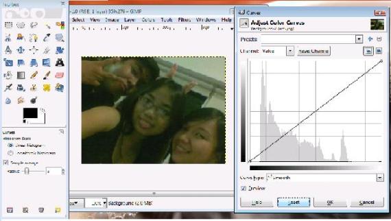
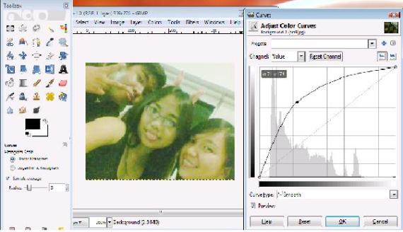
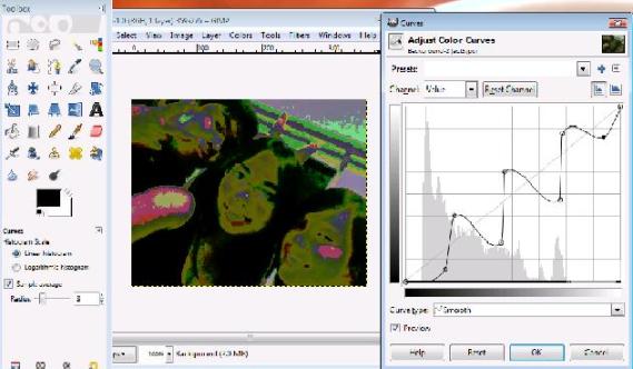
If you are not into programming, you could also use software for editing images such as the well known Adobe Photoshop and the free software Gimp.

Histogram Manipulation using Gimp

Scilab codes:

stacksize(10000000);

image= gray_imread(‘D:\files\kaye\186\grayscale2.jpg’);
[imx,imy] = size(image);
scf(0), subplot(1,2,1), imshow(image);
histogram = tabul(image,’i’);
s=imx*imy;
PDF = histogram/s;
scf(1), subplot(2,2,1), plot(PDF);  ;
cdf=cumsum(PDF);
CDF=cdf/max(cdf);
subplot(2,2,2), plot(CDF(:,1), CDF(:,2));
x=[]
y=[]
for i= 1:length(CDF(:,1));
x(i)=i;
y(i)=i^.7;  // vary for other CDF results
end
y=y/max(y);
CDF2=[x,y];
scf(1),subplot(1,2,1), plot(x,y);
adjusted = [];
for i=1:imx
for j=1:imy
a= find(histogram(:,1)==image(i,j));
adjusted(i,j)= y(a);
end
end
[adjx,adjy]=size(adjusted);
s_adj=adjx*adjy;
PDF2=(tabul(adjusted, ‘i’))/s_adj;
subplot(1,2,2), plot(PDF2(:,1),PDF2(:,2));
scf(0),subplot(1,2,2), imshow(adjusted);

So there, next time you take a picture and you find it too dark or too bright or just too boring try playing around with the histogram. Enjoy 😀

I would like to thank Gladys, Tisza, and Rob for their insights and tips.

I give myself a grade of 9 for this activity since I have completed the requirements but failed to submit on time.

Sources:

[1] Dr. Maricor Soriano. “A4 – Enhancement by Histogram Manipulation”, 2010

[2] Dr. Maricor Soriano. “A3 – Image Types and Formats”, 2010

[3]http://www.pixelperfectdigital.com/free_stock_photos/data/509/medium/grayscale_flower.jpg

Act 6. Fourier Transform Model of Image Formation

This activity explores the properties of the Fourier transform

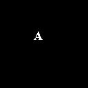
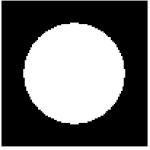
The first part involves mainly the familiarization with basic Scilab commands for Fourier transform like fft2 and fftshift. Two images were observed for this part one being a circle and the other is the letter A. After calling the image via ‘imread’ fft2 was then used to obtain the Fourier transform of the images. The use of fft2 resulted into a matrix containing complex numbers which cannot be used to create images to visualize the result so the abs() command was also invoked to obtain the absolute values of the matrix elements. The fftshift on the othe

r hand works by taking the matrix element with highest value and shifting them towards the center. The images obtained for the whole process is presented in figure 1.

Figure 1. Applying the fast fourier transform command on images. From left to right: grayscale of the original image, invoking fft2, applying fftshift, applying fft2 for the second time.

Due to the scale and low resolution of the image, the results are not so clear. However, it can easily be said that the fourier transform of a fourier transform will result to the original state but in an inverted position.

Next analysis was done on the convolution of two images. In particular, a simulation of an imaging device was done. 2 128X128 pixels image was used, both having a black background. The image with a white ‘VIP’ text will our image of interest while a white circle in will serve as our aperture. The two images was convolved by getting the product of their individual fft’s following the rule that if h=f*g then H=FG where here, (*) represents convolution, the small letters are functions while the capital letters are fourier transform of their respective smaller letter. It was observed that the clarity of the resultant image is dependent upon the radius of the aperture, i.e., the resulting image blurs out as the radius of the aperture decreases. In figure 2 we can see two set of images. The left most images for each set is the aperture and the right most are the result.

Figure 2. Simulation of imaging device.

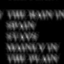
The third part of the activity uses fast fourier transform to obtain the correlation of two images. Correlation is a measure of similarity between two functions. This measure can be related to fourier transform such that if p is the correlation between functions f and g then P, F, and G, the fourier transforms of the functions denoted by their corresponding small letter, is given by the equation P=F*G where (*) indicates complex conjugate.

Figure 3. Top 2 images were the ones compared while the bottom image is their correlation.

For this, we compared  an image containing the phrase ‘THE RAIN IN SPAIN STAYS MAINLY IN THE PLAIN’ and an image containing the letter ‘A” of the same font. The images and their correlation can be seen in figure 3. Five bright spots can be seen in the resultant image, the same number of A’s found in the first image, these indicate the spots with highest correlation with the second image.

Finally, we were asked to do an edge detection using convolution integral. Here, we used the same ‘VIP’ image used for part two and convolved it with different 3×3 matrix patterns whose total sum is zero. I used the following matrices for my pattern:

pattern1= [-1 -1 -1; 2 2 2; -1 -1 -1];

pattern2= [-1 2 -1; -1 2 -1; -1 2 -1];

pattern3= [-1 -1 -1; -1 8 -1; -1 -1 -1];

pattern4 = [1 1 1; 1 -8 1; 1 1 1];

Figure 4. Edge detection using patterns 1-4.

Comparing the results for patterns 1 and 2 (top 2 images in figure 4) it could be seen that the horizontal edges of the letter is more defined for pattern 1 while the vertical edges is more defined for pattern 2 which are comparable to the position of the number ‘2’ in their respective patterns. Comparing results for patterns 3 and 4 (bottom 2 images in figure 4), it is noticeable that the dark outline of the letters for pattern 3 and 4 is at different positions. For pattern 3 the dark outline can be seen after the white outline while for pattern 4 it is the other way around. For both cases, however, the position of the outline corresponds to the position of the negative sign in the matrix patterns.

I will give myself a grade of 9 for being able to simulate what is asked.

I would like to thank Tisza, and Jonats from whom I confirmed if I was getting the right results

Sources:

[1] Dr. Maricor Soriano. “A6 – Fourier Transform Model of Image
Formation”, 2010

Scilab codes:

—//6A. circle
//x = [-1:0.01:1];
//[X,Y] = meshgrid(x);
//r = sqrt(X.^2 + Y.^2);
//circle = zeros(size(X,1), size(X,2));
//circle(find (r <=0.5)) = 1.0;
//subplot(1,5,1), imshow(circle,[]);
//Igray = im2gray(circle);
//FIgray = fft2(Igray); //remember, FIgray is complex
I = imread(‘D:\files\kaye\186\circle_6_3.bmp’);
//gray = im2gray(I);
//FIgray = fft2(Igray); //remember, FIgray is complex
//subplot(1,5,1), imshow(I, []);
//subplot(1,5,2), imshow(abs(FIgray),[]);
//subplot(1,5,3), imshow(fftshift(abs(FIgray)), []);
//subplot(1,5,4), imshow(abs(fft2(FIgray)),[]);
//subplot(1,5,5), imshow(abs(fft2(fft2(I))),[]);

//6A. letter A
//I= imread(‘D:\files\kaye\186\letterA.bmp’);
//image=(I-min(I))/(max(I)-min(I));
//subplot(1,5,1), imshow(image);
//Igray = im2gray(image);
//FIgray = fft2(Igray); //remember, FIgray is complex
//subplot(1,5,2), imshow(abs(FIgray),[]);
//subplot(1,5,3), imshow(fftshift(abs(FIgray)), []);
//subplot(1,5,4), imshow(abs(fft2(FIgray)));
//subplot(1,5,5), imshow(abs(fft2(fft2(image))));

//6B. convolution
//rgray = im2gray(I);
//image= imread(‘D:\files\kaye\186\VIP.bmp’);
//agray = im2gray(image);
//Fr = fftshift(rgray);
//aperture is already in the Fourier Plane andneed not be FFT’ed
//Fa = fft2(agray);
//FRA = Fr.*(Fa);
//IRA = fft2(FRA); //inverse FFT
//FImage = abs(IRA);
//final = (FImage-min(FImage))/(max(FImage)-min(FImage));
//imshow(final);
//imwrite(final, ‘D:\files\kaye\186\vip_mid_aperture.jpg’)

//6C. Template matching using correlation
//text = imread(‘D:\files\kaye\186\text.bmp’);
//text_gray= im2gray(text);
//a = imread(‘D:\files\kaye\186\a.bmp’);
//a_gray = im2gray(a);
//ftext = fft2(text_gray);
//fa = fft2(a_gray);
//im = fa.*(conj(ftext));
//FImage = fft2(im);
//FImage= abs(FImage);
//imshow(FImage, []);
//final = (FImage-min(FImage))/(max(FImage)-min(FImage));
//imwrite(final, ‘D:\files\kaye\186\correalation.jpg’);

//6D. Edge detection using the convolution integral
pattern1= [-1 -1 -1; 2 2 2; -1 -1 -1];
pattern2= [-1 2 -1; -1 2 -1; -1 2 -1];
pattern3= [-1 -1 -1; -1 8 -1; -1 -1 -1];
pattern4 = [1 1 1; 1 -8 1; 1 1 1];
pattern5 = [-3 -3 -3; 2 2 2; 1 1 1];
image= imread(‘D:\files\kaye\186\VIP.bmp’);
gray = im2gray(image);
result = imcorrcoef(gray, pattern1);
result = (result – min(result))/(max(result)/min(result));
imshow(result);
imwrite(result, ‘D:\files\kaye\186\6D_1.jpg’);
//repeat for all pattern

note: remove ‘//’ to un-comment

Act 4. Area Estimation for Images with Defined Edges

The basic premise of this activity is to be able to  estimate the area of a figure with defined edges using Green’s theorem and Scilab. Green’s theorem generally relates a double integral over a certain region with a line integral around that region. The equation is given by:

Where the F’s are functions. By choosing appropriate functions we can reduce this equation such that we have an equation to determine the area of a closed region:

Which in discretized form yields:

Using the final form of the equation, we can now determine the area of an image with the aid of scilab. We begin by generating black and white images of simple shapes using Scilab or paint. I used MS Paint for this part as I find it easier to draw these images than generate ones. It must be noted that the figure of interest must be in white while the background is in black. I picked a square and circle as my test subjects.

Images of the shapes I used to test Green’s theorem

For the square, it was found that:

area  computed using green’s theorem= 9751.5 square pixels
actual area  = 9801. square pixels
error = 0.5050505 %

The actual area was obtained by getting the number of pixels in one row  of the figure and squaring it.^

For the circle, the values obtained were:

area  computed using green’s theorem=84623.5 square pixels
actual area  = 73541.542 square pixels
error  = 15.068976   %

In this case the actual area was obtained by getting the number of pixels along the diameter and using the equation for the area of a circle which is A= Πr^2

It is noticeable that the discrepancy between the error values for the two shapes are quite big. This may be attributed to the fact that a real circle has a smooth curved edge which is what is assumed in the equation for the area of a circle. However, actual data, which was used for the computation of area using Green’s theorem, does not exactly resemble a perfectly smooth curved edge, instead it is approximated with small squares with finite value as can be clearly seen by magnifying the object. Thus the discrepancy between the error values lies in the difference between the assumptions and actual data for the two shapes.

Scilab code:

/part 1
//square
image= imread(‘D:\files\kaye\186\square.bmp’);  //load image to scilab
[sqx , sqy] = follow(image);  //folows contour of binary object
x=length(sqx);

//green’s theorem
for i = 1:x-1
sq(i)=sqx(i)*sqy(i+1)-sqx(i+1)*sqy(i);
end
area = sum(sq)/2

actual = (max(sqx)-min(sqx))^2  //actual area
error = ((actual-area )/actual)*100

//circle

circle = imread(‘D:\files\kaye\186\circle.bmp’);
[circx , circy] = follow(circle);
x=length(circx);

//green’s
for i = 1:x-1
circ(i)=circx(i)*circy(i+1)-circx(i+1)*circy(i);
end
area = sum(circ)/2

actual = (((max(circx)-min(circx))/2)^2)*%pi
error = (abs(actual-area )/actual)*100

The second part of this activity is applying the technique to real life. Particularly, the land area of a desired location will be computed using the same way as presented above. I chose the Ninoy Aquino International Airport Terminal 3 (NAIA 3) as my test subject for this part.

NAIA 3 is the most recent and biggest among the terminals of the said Airport. It’s building 182, 500 square meters and was build on a 63.5 hectares of land.

naia 3

Ninoy Aquino international Airport terminal 3 bird's eye view

naia3

A rendering of NAIA terminal 3

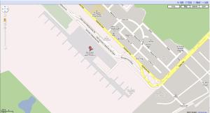
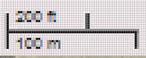
First I looked for NAIA terminal 3 in Google Maps to have a scaled image of its land area. Using the scale bar provided by Google maps, I was able to find how many square meters each square pixels represents by the same technique as in Activity 1.

naia3map

Map of NAIA terminal 3

scale

Scale provided by Google Maps

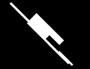
The map was editted such that NAIA terminal 3 was left, it was then turned to a black and white image where the land area of the terminal was left white while the whole background was turned to black.

naia3bw

NAIA terminal 3 in black and white

Using the same technique as above the following observations were made:

scaling factor = 2.972652 with an uncertainty of 0.000297

naia3_area  = 533619.2 square meters
error  =193.19736 %

There was a big discrepancy between the actual area of the terminal and the area I was able to compute. Some of the possible reasons for this error are:

  • The method I used to separate the terminal from the rest of the image is not accurate at all, I might have included some area that I should not have or the other way around.
  • The actual area I compared with my results is the area for the building only. I am not, however, aware of the actual boundaries of this ‘building’. I may have included parts of the terminal that are not really accounted for as part of that ‘building’.
  • The uncertainty with the scaling factors I’ve used.

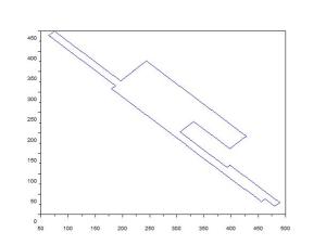
I think I should have used the total land area of 68.5 hectares or 685000 square meters because then my error would go down to 15.96548 %. I guess I’m really at lost with what is the actual area of the part I computed for although I think it does not really matter since I was able to do what I was supposed to. As a proof that I computed for the right area I plot the contour of the image I followed and got:

contour

Contour of the area to be computed

Which resembles the area of interest I was computing. From here I could say that I was doing the right thing except for comparing with the right values.

I give myself a grade of 9 for this activity. Although I have a huge error for the second part, I was able to apply the technique successfully for the other parts implying that I have learned what I have to learn.

I would like to thank Rob Entac for sharing some ideas on this activity and Jonathan Abat for tellingme how to check if I’m really following the right contour.

References:

[1] A2 – Area Estimation for Images with Defined Edges Manual prepared by Dr. Maricor Soriano, 2010

[2] http://en.wikipedia.org/wiki/Ninoy_Aquino_International_Airport

for the images:

[3] http://maps.google.com

[4] http://www.airport-technology.com/projects/ninoaquino/ninoaquino1.html

[5] http://mymanila-ph.blogspot.com/2008/07/manila-international-airport-t3.html